
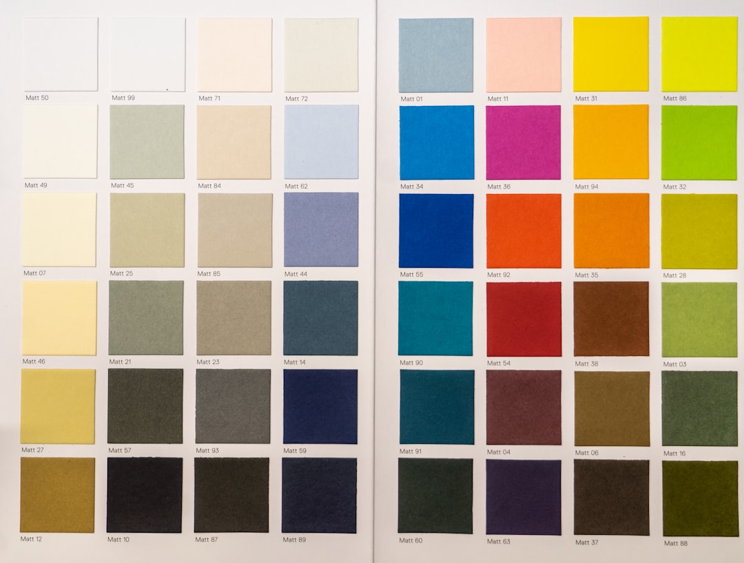
Mixing colors in your home can feel risky: too many hues and your room looks chaotic; too few and it feels flat. The goal is a balanced, intentional palette that reads cohesive from the doorway. These practical rules and examples help you pair colors confidently so your space feels layered, calm, and purposeful.
Start by defining a simple color story, anchor with neutrals, and repeat colors in different textures and scales. Small adjustments—a single pillow swap, a new vase, or a curated art grouping—can transform a busy-looking room into a composed, inviting space. For inspiration and items that help execute these strategies, check curated Home Decor.
1. Start with a clear color story
Choose one main color family for the room (warm neutrals, cool grays, soft blues, etc.). That dominant family sets the mood and helps every other choice relate back to it. Anchor the room with a large piece—usually a sofa or rug—that represents the dominant tone. If you need a practical starting point for big investments that establish color, browse Sofas & Sectionals to find shapes and neutrals that let accent colors shine.
2. Use a three-part hierarchy: dominant, secondary, accent
Limit your palette to a dominant color (about 60%), a secondary (25%), and an accent (15%). That rule prevents visual overload and keeps contrast intentional. The secondary color can appear on chairs, throws, or a painted wall; the accent is used sparingly in accessories like a single chair, a lamp, or a bold side table. If you want a statement seat that reads as an accent without overwhelming, explore Accent Chairs & Ottomans.
3. Anchor with neutrals and textures
Neutrals are your calming foundation—white, warm beige, charcoal, or soft taupe. They reduce busyness and give your eyes resting points. Use neutrals across walls, large furniture, and big textiles, then layer color through texture (linen, boucle, woven baskets). Window treatments and large wall elements can act like a neutral frame; consider adding structured, neutral elements from Wall & Window Decor to contain and enhance your color choices.
4. Repeat colors across materials and finishes
Repetition makes disparate pieces feel deliberate. Repeat your accent color in three places at minimum—ideally across different materials: a ceramic vase, a throw, and a framed print. This creates visual threads the eye follows, which simplifies busy palettes. Small accent items like curated ceramics or metallics can help; browse Vases & Accent Pieces for pieces that echo your chosen hues without crowding the room.
5. Scale and spacing: how much color to use
Scale matters. A small, bright print pillow jumps off a neutral sofa; a full patterned rug becomes the room’s focal point. If you pick a bold pattern for a large surface, keep other colors muted. For inexpensive, high-impact swaps that control scale—like pillow sets—choose coordinated covers in your accent shades. A practical option is a set of throw pillow covers such as EcoLily Decorative Throw Pillow Covers, which let you test combinations without commitment.
6. Limit patterns and control contrast
Patterns add personality but can quickly make a space feel busy. Use no more than three patterns per room and vary their scale: one large-scale, one medium, and one small. Keep contrast in mind—high-contrast patterns are energetic, low-contrast patterns are subtle. When combining bold patterns, tie them together with a shared color. Also, use solid color breaks—curtains, large rugs, or painted furniture—to give patterned areas breathing room. If storage and tidy surfaces help reduce visual clutter that competes with patterns, consider functional pieces like the VECELO 4-Tier Tall Narrow Storage Cabinet to keep accessories curated and surfaces simple.
7. Layer with accessories strategically
Accessories should support your color story, not distract from it. Group items in odd numbers, vary heights, and include at least one reflective or light-catching object to balance matte textures. Swap one or two pieces seasonally to refresh the palette without starting over. A single sculptural piece can anchor a vignette; for instance, a minimalist accent like the Bookend Vase for Flowers provides color and form without adding clutter.
8. Practical swaps and small experiments
Not ready to repaint or buy new furniture? Start small: swap pillow covers, add a throw, replace a lampshade, or change tabletop decor. Keep one shelf or table as your “color lab” — try different groupings and photograph them. Over time you’ll see which hues repeat naturally and which feel forced. This method prevents costly mistakes and helps you fine-tune the palette before making major purchases.
Quick checklist
- Define dominant (60%), secondary (25%), and accent (15%) colors.
- Anchor with neutrals for walls, large furniture, and flooring.
- Repeat each accent color in at least three places and across materials.
- Limit patterns to three per room and vary their scale.
- Use odd-numbered groupings and mix heights in vignettes.
- Test with inexpensive swaps: pillows, vases, throws, and frames.
FAQ
Q: How many colors are too many for one room?
A: Aim for three main colors (dominant, secondary, accent) plus neutrals. More variations are fine if they read as tones of those three.
Q: Can I mix warm and cool tones?
A: Yes—balance them by choosing one as dominant and using the other as accents. Introduce a transitional neutral (greige) to harmonize the mix.
Q: How do I make a small room feel less busy?
A: Use lighter neutrals on walls, limit bold patterns, and repeat a single accent color in small doses. Keep surfaces clear and storage organized so color stands out rather than competes.
Q: Where should I put my boldest accent?
A: Place it where you want the eye to land—often opposite the room entry or on the largest visible surface like a gallery wall, a statement chair, or a rug.
Q: How can I test colors before committing?
A: Use removable covers and small accessories to trial combinations. Photograph groupings at different times of day for true-light assessment.
Conclusion
Mixing home decor colors without making a space look busy is about deliberate limits and thoughtful repetition. Start with a clear color story, anchor it with neutrals, and repeat accents across textures and scales. Small swaps and strategic storage keep surfaces calm and let your chosen colors sing—one measured change at a time.
Products Featured in This Article

VECELO 4-Tier Tall Narrow Storage C…
Adjustable Shelving System: VECELO tall storage cabinet measures 14.57" W x 11.42" D x 65.35"H with…

Bookend Vase for Flowers – Cu…
Home Office Charm: Elevate the aesthetic of your home office with this charming Bookend Vase. Its…

EcoLily Decorative Throw Pillow Cov…
Make sure this fits by entering your model number. Fabric Type: Premium Soft 100% Cotton IT…